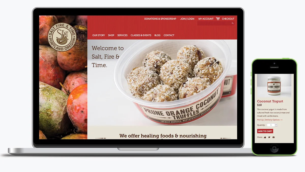


An uplifting, stylish e-commerce responsive website that supports a health conscious community by offering a variety of culinary classes, products, and services.
My Roles
Research
User Experience
Interactive Design
Responsive Design
Objective
To redesign the Salt, Fire, & Time website to create a thriving, encouraging, and nourishing community, online and in stores.
Process
Salt, Fire & Time produces traditional healing food products on a community scale. After initial interviews with the Client, we learned that often SFT’s customer’s were changing their dietary habits to heal from illness. I collaborated with the Art Director to sketch the initial wireframes and design concepts that balanced the playful optimism of SFT’s branding with a user experience that empowers customers to quickly find the information they are looking for.After presenting the two concepts to the Client, refinements were noted as I moved the chosen concept into full design. I designed the user experience, visuals, and responsive mobile layouts with counsel of the Art Director. Final steps included production of pristine digital files, style guides, and slices to the development team.
Solution
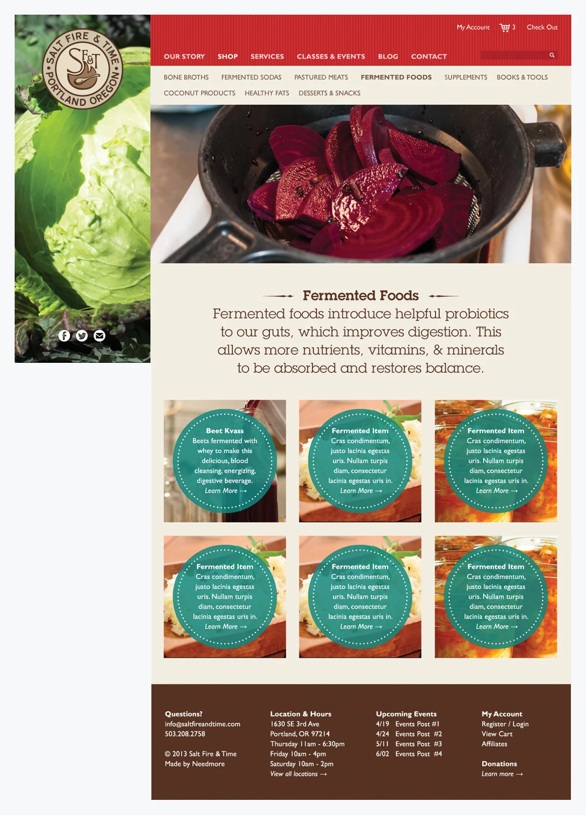
This stylish e-commerce responsive website has three unique layouts for desktop, tablet, and mobile. On desktop, the left third of the website locks into place with images representative of SFT. The right 2/3rds of the website scrolls, revealing a playful combination of content and form.
On the home page. different color panels walk new users through the Salt, Fire and Time story, from the healing foods and products, to services, to the thriving community, to an invitation to connect. A variety of images and playful iconic embellishments convey the blend of traditional with a modern twist.
On tablet, the left hand locked image disappears, and the trademark and social icons are brought to the main navigation.
On mobile, the main navigation features a hamburger navigation menu, and the remaining content reduces and grows smaller to adapt to mobile size.
Designed while employed at Needmore Designs:
Corinna Gelster-Borgardt, Design
Raymond Brigleb, Creative Direction